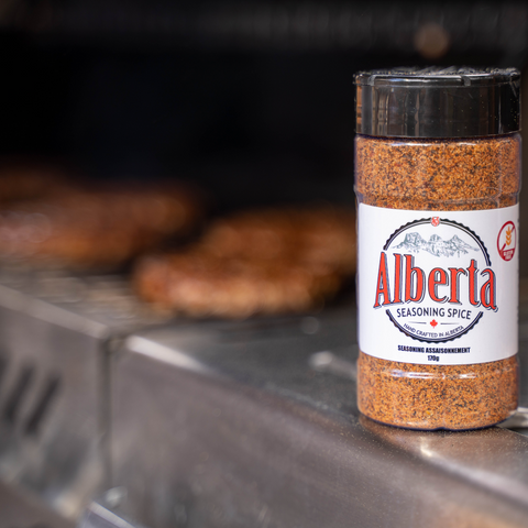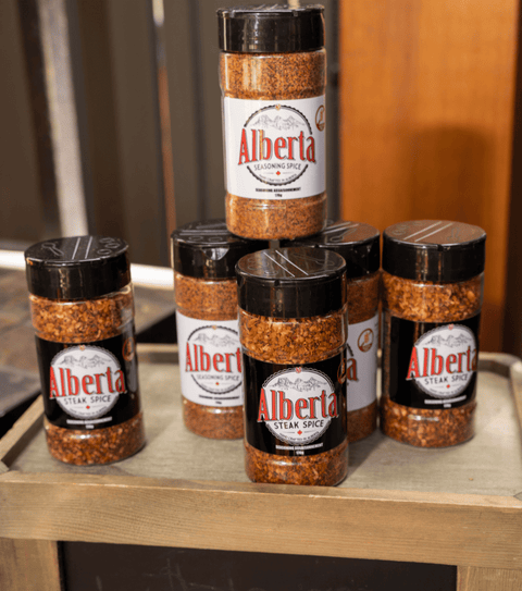
Buy Alberta Steak Spice in Store: Locations

This page is here to show off styles for standard page elements such as typography, form elements, and icons. These are hard coded in an alternate page template file, named page.styles.liquid.


Typography

Heading one

Heading two

Heading three

Heading four

Heading five
Heading six

RTE headings

RTE heading one

Lorem ipsum dolor sit amet, consectetur adipiscing elit, sed do eiusmod tempor incididunt ut labore et dolore magna aliqua.

RTE heading two

Lorem ipsum dolor sit amet, consectetur adipiscing elit, sed do eiusmod tempor incididunt ut labore et dolore magna aliqua.

RTE heading three

Lorem ipsum dolor sit amet, consectetur adipiscing elit, sed do eiusmod tempor incididunt ut labore et dolore magna aliqua.

RTE heading four

Lorem ipsum dolor sit amet, consectetur adipiscing elit, sed do eiusmod tempor incididunt ut labore et dolore magna aliqua.

RTE heading five

Lorem ipsum dolor sit amet, consectetur adipiscing elit, sed do eiusmod tempor incididunt ut labore et dolore magna aliqua.

RTE heading six

Paragraphs

Lorem ipsum dolor sit amet, consectetuer adipiscing elit, sed diam nonummy nibh euismod tincidunt ut laoreet dolore magna aliquam erat volutpat. Ut wisi enim ad minim veniam, quis nostrud exerci tation ullamcorper.

Suscipit lobortis nisl ut aliquip ex ea commodo consequat. Duis autem vel eum iriure dolor in hendrerit in vulputate velit esse molestie consequat.

Type styles

Blockquotes

Eu feugiat nulla facilisis at vero eros et accumsan et iusto odio dignissim qui blandit praesent luptatum zzril delenit augue duis dolore te feugait nulla facilisi. Nam liber tempor cum soluta nobis eleifend option congue nihil imperdiet doming id quod mazim placerat facer possim assum.

The author of the quote

Lists

ul (default)
  • One
  • Two
  • Three
  • Four
Numeric bullet ol (default)
  1. One
  2. Two
  3. Three
  4. Four
Inline list ul
.list--inline
  • One
  • Two
  • Three
  • Four
Child lists (to match the RTE styles)
  • One
  • Two
  • Three, with child list
    • First sub item
    • Second sub item
    • Third sub item, with child list
      • Third level item
      • Another third level item
  • Four

Responsive tables

Order Date Payment Status Fulfillment Status Total
#1001 December 22, 2015 Authorized Unfulfilled $43.03
#1002 December 23, 2015 Authorized Unfulfilled $44.03
#1003 December 24, 2015 Authorized Unfulfilled $45.03
#1004 December 25, 2015 Authorized Unfulfilled $46.03
#1005 December 26, 2015 Authorized Unfulfilled $47.03
#1006 December 27, 2015 Authorized Unfulfilled $48.03

Forms

Default form elements

Invisible labels

Add a class of label--hidden to a label to visually hide it, while keeping it accessible to screen readers. Use the placeholder attribute as your visible label.

Note: The placeholder attribute only works in IE10+, so invisible labels are disabled in IE9 and below.


Vertical forms (customer, contact, etc)

No styles for this exist in Slate, but are used in most themes. Style elements inside a form/div with class `form-vertical` to see your styles here.

You cannot add a class directly to most liquid form elements (e.g. {% form 'contact' %}). Instead, wrap the form in a div with the class .form-vertical to achieve the same effect.

Checkboxes

Radios

Notes and form errors

No note styles exist in Slate but are commonly added to handle form errors. Example styles:

    .note {
      padding: 20px;
      border: 1px solid #ccc;
    }

    .note--success {
      border-color: green;
      background-color: lightgreen;
    }

    .errors {
      border-color: red;
      background-color: lightred;
    }
  

Example usage:

    {% if form.posted_successfully? %}
      <p class="note note--success">Thanks for submitting the form</p>
    {% endif %}

    {% if form.errors %}
      <div class="note errors">
        {{ form.errors | default_errors }}
      </div>
    {% endif %}
  
This is a standard note
This is a success message

This is an error message.

  • Bullets can offer more insight to the error

Buttons

Default button

Default button (no defaults)

Button disabled

Wide button (no defaults)


Miscellaneous elements

Horizontal Rules

There are no default hr styles in Slate, but these are common ones to add.

Default hr


Invisible hr.hr--clear


Small hr.hr--small


SVG icons

Read more about using, creating, and editing SVG icons in Slate's documentation.

Payment icons

Social icons

General icons